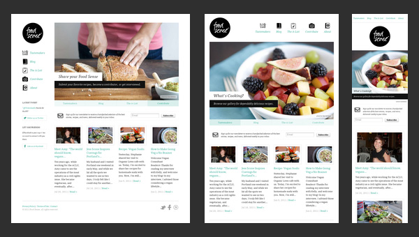
5 Essential Principles of Responsive Web Design You Need to Master
Responsive web design is a crucial element for creating a seamless user experience across a variety of devices. The first principle to master is fluid grids. Unlike fixed-width layouts, fluid grids use relative units, allowing elements to resize proportionally within their containers. This flexibility ensures that your website looks good on both large screens and mobile devices. Secondly, employing media queries enables you to apply different styles to your site based on the screen size and resolution. By defining breakpoints, you can tailor your web design to cater to users on various platforms, making your content more accessible.
Another essential principle is the use of flexible images, which allows images to scale within their containing elements. By setting max-width to 100%, you ensure that images do not overflow their containers, maintaining the integrity of your layout. Additionally, mobile-first design is a strategy that prioritizes the mobile experience in the initial design phase, simplifying functionality and progressively enhancing features for larger screens. Finally, embracing consistent typography across different devices helps maintain readability and enhances the overall aesthetic of your site, which is vital for retaining user engagement.
The Hidden Benefits of Mobile-First Design: What Your Competitors Overlook
Mobile-first design is not just a trend; it's a necessity in today's digital landscape. As more users access the internet through mobile devices, businesses that prioritize mobile-first strategies often enjoy enhanced user experience and engagement. By focusing on mobile-first design, your website can lead to improved load times and usability on smaller screens, which can significantly reduce bounce rates. Competitors who overlook this crucial aspect miss out on the opportunity to capture a larger share of the market, as users are more likely to navigate away from websites that aren't optimized for mobile.
Moreover, adopting a mobile-first approach can positively impact your SEO efforts. Google’s algorithm favors mobile-friendly sites, so by designing with mobile users in mind, you're not just enhancing their experience; you're also boosting your site's credibility in the eyes of search engines. This can lead to higher ranking positions and increased organic traffic. Therefore, while your competitors might be stuck in traditional web design methods, embracing mobile-first design could set you apart, giving you a competitive edge that translates to higher conversion rates and greater customer satisfaction.
Are You Making These Common Responsive Design Mistakes?
Responsive design is essential for ensuring that your website provides a seamless user experience across all devices, but many webmasters make common mistakes that can hinder effectiveness. One major error is neglecting to test your site on multiple devices and screen sizes. Failing to perform real-world testing can lead to overlooked issues like text being too small, buttons being hard to click, or images being displayed incorrectly. It's vital to utilize tools and real devices to ensure that your design works well on desktops, tablets, and smartphones alike.
Another frequent mistake is using fixed-width layouts, which can be detrimental in a world where users access content from various screen dimensions. Instead of adhering to a fixed design, embrace a fluid grid system that allows your layout to adapt dynamically. Moreover, ignoring touch targets with adequate spacing for mobile devices can frustrate users. Ensure that buttons and links are large enough for easy tapping to improve user interaction and overall satisfaction with your site.