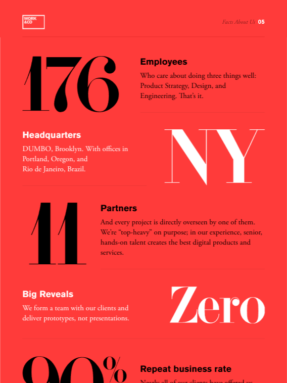
Top 5 Factors to Consider When Choosing a Typeface for Your Website
Choosing the right typeface for your website is crucial for both aesthetics and functionality. The first factor to consider is readability. A typeface should be easy to read across different devices and screen sizes. Avoid overly decorative fonts, as they can distract readers and reduce engagement. Secondly, think about legibility. Ensure that your chosen typeface maintains clarity even at smaller sizes. Test your font choices in various contexts to assess how well they convey your message.
The third factor is brand identity. Your typeface should reflect your brand’s personality and values, contributing to a cohesive visual experience. Additionally, consider font pairing; using complementary typefaces can enhance your website’s design while maintaining harmony. Lastly, don't overlook performance. Web fonts can impact loading times, so choose fonts that optimize speed and user experience. By evaluating these factors, you can select a typeface that effectively communicates your brand's message and improves overall usability.
The Impact of Typography on User Experience: What You Need to Know
Typography plays a crucial role in shaping the user experience on any website or digital platform. The choice of font, its size, spacing, and color can significantly influence how content is perceived, read, and understood. For instance, a well-chosen typeface can improve readability and create a visual hierarchy, guiding users through the content seamlessly. Conversely, poor typography can lead to confusion and frustration, ultimately resulting in high bounce rates. Therefore, it is essential to consider typography as a fundamental aspect of design that directly affects user engagement and satisfaction.
To gain a better understanding of the impact of typography on user experience, consider the following key factors:
- Readability: The clarity of the text plays a significant role in how users interact with content.
- Hierarchy: Different text styles can help delineate headings, subheadings, and body text, making it easier for users to navigate.
- Consistency: Using a cohesive typographic style enhances trust and familiarity among users.
By prioritizing these factors, designers can ensure that typography not only looks appealing but also serves its ultimate purpose: enhancing the overall user experience.
Serif vs. Sans-Serif: Which Typeface is Best for Your Brand?
When it comes to choosing a typeface for your brand, understanding the differences between serif and sans-serif fonts is crucial. Serif fonts, characterized by their small decorative lines at the ends of each letter, are often seen as more traditional and formal. They convey a sense of reliability and professionalism, making them ideal for brands in industries like law, finance, and academia. On the other hand, sans-serif fonts, which lack these embellishments, tend to evoke a modern, clean, and minimalistic feel. This style is frequently favored by tech companies and startups looking to project innovation and approachability.
Ultimately, the choice between serif and sans-serif depends on your brand's identity and target audience. If your goal is to communicate luxury or heritage, serif may be the way to go. Conversely, if you aim for a more contemporary and accessible look, sans-serif could better serve your needs. It's also worth considering how these typefaces perform in various applications, such as web design and print materials. Ensuring that the typeface aligns with your brand values and resonates with your audience can significantly enhance your brand's overall perception.
