What is Responsive Web Design and Why is it Important?
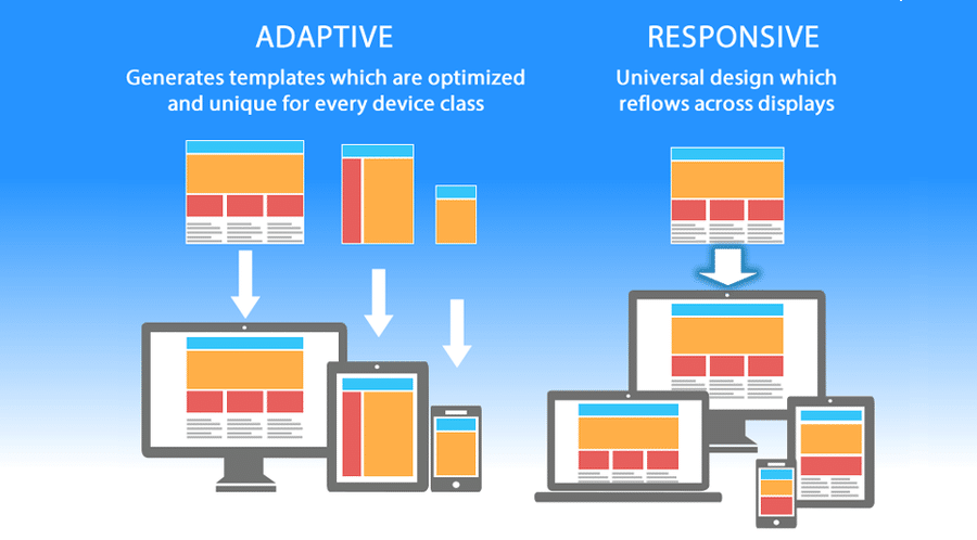
Responsive Web Design refers to the approach of designing websites in a way that ensures they provide an optimal viewing experience across a wide range of devices, from desktop computers to mobile phones. This design philosophy involves using flexible layouts, images, and CSS media queries to automatically adjust the web page's layout and content based on the size and resolution of the user's screen. By embracing responsive web design, developers can create a seamless user experience that accommodates diverse browsing environments and enhances usability.
The importance of responsive web design cannot be overstated in today's digital landscape. With an increasing number of users accessing websites on various devices, having a mobile-friendly site is essential for keeping visitors engaged and reducing bounce rates. Google also prioritizes responsive websites in its search rankings, making it crucial for businesses and bloggers to adopt this design strategy to improve visibility and attract more organic traffic. In conclusion, a well-implemented responsive web design not only enhances user satisfaction but also significantly boosts a website's overall performance.
Top 5 Benefits of Implementing Responsive Web Design
In today’s digital landscape, implementing Responsive Web Design (RWD) is crucial for optimizing user experience across various devices. One of the top benefits of RWD is improved user experience. With an adaptable layout that adjusts seamlessly to different screen sizes, users are more likely to engage with your content, reducing bounce rates and increasing the time spent on your site. An effective RWD implementation ensures that your website looks great and functions well, whether accessed from a desktop, tablet, or smartphone.
Another significant advantage is the enhanced SEO performance. Search engines, particularly Google, prioritize mobile-friendly websites in their rankings. With a single, responsive site, your SEO efforts are streamlined, avoiding potential penalties associated with duplicate content from separate mobile sites. Moreover, a unified URL structure simplifies link building and makes it easier for users to share your content, ultimately driving more traffic to your site.
How Responsive Web Design Enhances User Experience and Improves SEO
Responsive web design is essential for creating an optimal viewing experience across a variety of devices, be it a desktop, tablet, or smartphone. By ensuring that your website adapts seamlessly to different screen sizes, it allows users to navigate more freely and consume content without unnecessary zooming or scrolling. This adjustment not only enhances user experience but also contributes to higher engagement rates, as visitors are more likely to stay longer on a site that functions effectively on their chosen device.
From an SEO perspective, search engines like Google prioritize mobile-friendly websites in their ranking algorithms. This means that a site employing responsive web design is more likely to achieve higher visibility in search results. Moreover, a unified URL structure, which is a hallmark of responsive design, simplifies social sharing and link building, further enhancing SEO efforts. In summary, adopting a responsive design approach not only improves user experience but also serves as a crucial strategy for boosting your site's SEO performance.